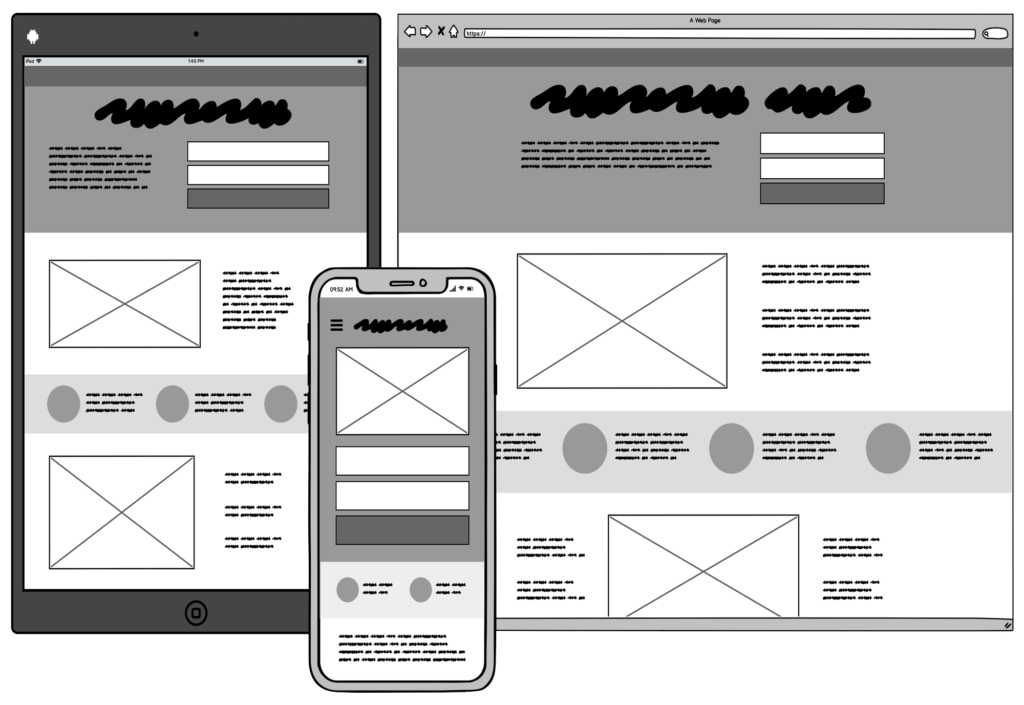
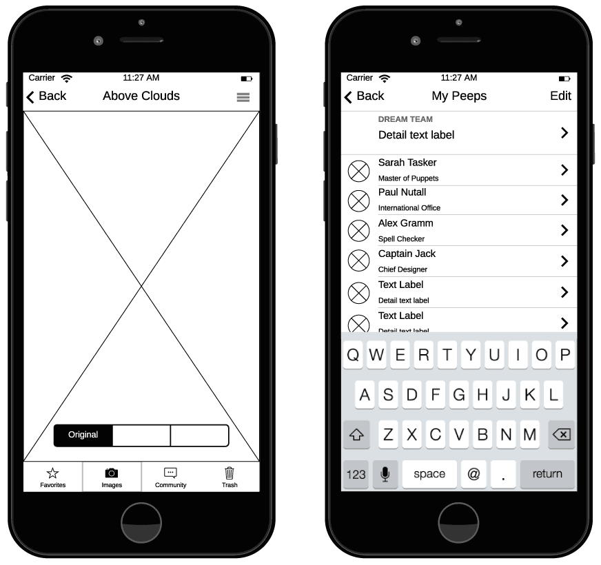
A Wireframe is a map of screens that shows navigation between them and the minimum detail that should be located on a particular screen.

Wireframes have limited visual characteristics since most design elements (eg images, videos, colors, real text, etc.) are not included in this tool. Instead of specific elements, designers use placeholders. For example, a square with a cross represents an image. This technique is important - object placeholders and a gray palette help to focus on the layout and structure of the page, rather than on the visual aspects of the design.
Sometimes customers may not understand what "main image", "integration with Google map", "product filtering" and hundreds of other terms mean. Wireframing of specific functions gives the client clear information about how they will work, where they will be placed, and how useful they can actually be.
It happens that looking at the wireframe, it becomes clear to the customer or team that it is better to abandon some functions. When we look at features without the influence of colors and pictures, we see how they work in their pure form and how they correspond to the goals and objectives of the product. At this stage, it is easier and faster to make changes. At the same time, the budget for such work is quite small - the screens are made without detailing, which significantly reduces the cost of the artifact.
Wireframes' advantages
One of the big advantages of the wireframe is that it provides an early visualization that can be used for review with the client. Users can also view it as an early feedback mechanism for testing the usability of the prototype.
From a practical point of view, wireframes ensure the correct placement of the content and functions of the page under the needs of users and businesses. And as the project progresses, they can be used as a useful dialogue within the team to coordinate the vision and scope of the project.
Wireframe and prototypes are not the same things
Many people use the terms "wireframe" and "prototype" as synonyms, but there are significant differences between them: they look different, they communicate different things, and serve different purposes.
Prototyping is the process of creating an interactive experience. A prototype is a final product, including a simulation of interaction with the user interface.
Unlike wireframes, which often look the same, prototypes can vary significantly. These can be both simple artifacts that reflect elementary interactions, and clickable tools that look and work almost like a real product.
By the way, in our cases, we publish links to such clickable prototypes. Try it to clearly understand how it works.
Prototypes serve as a bridge to the real product. The purpose of prototyping is to show the connection of screens through the user experience and their purpose. This makes it convenient for testing with real users - prototypes allow participants to interact with the design in the same way as they interact with the finished product.
How we use Wireframes in the YuSMP Group

As a rule, we suggest making wireframes at the discovery phase to work out the screens of a mobile or web application.
In wireframes, we describe information about the goals of the screen and schematically draw the elements that we plan to place there. Most often, we work on this tool in parallel with the BPMN diagram. After the wireframes are drawn and agreed with the customer, and the diagram is worked out, we combine these artifacts into one. Such a move makes it possible to see which screens are missing in the process diagram, or which processes we did not take into account when working out BPMN.
So, with the help of wireframes and BPMN diagrams, we ensure the integrity of the business processes of the future application. Wireframes also significantly save time and money at the testing stage and making corrections at later stages of the project.