Class soup readability
Hundreds of utility classes per component make code review painful. We enforce CVA component APIs so variant logic is typed and centralised.

Design tokens shadcn/ui Radix UI WCAG 2.2
We have built production Tailwind design systems across SaaS portals, clinical workstations and B2B marketplaces — with design tokens that survive rebrands, dark-mode parity tested in Chromatic, and WCAG 2.2 AA accessibility validated per component. ANT's PropTech marketplace, ArgoView's regulated clinical UI and SuperStep's retail POS — all Tailwind-powered.

We deliver Tailwind CSS engineering for SaaS teams adopting Tailwind on a new project, design-system migrations from Bootstrap or Material UI, accessibility-compliant component libraries for regulated industries, and teams scaling Tailwind across multiple products with shared design tokens. shadcn/ui and Radix UI for accessible primitives, CVA for typed component APIs, Storybook and Chromatic for visual regression.
Challenges
Hundreds of utility classes per component make code review painful. We enforce CVA component APIs so variant logic is typed and centralised.
Multiple Tailwind configs diverge across micro-frontends. We establish a shared token package as the single config source consumed by all products.
Dark variants added ad-hoc miss components and create visual bugs. We implement semantic tokens swapped at the config level so dark mode is systematic.
Arbitrary value usage bypasses design tokens. We enable strict config mode and lint against arbitrary values in CI.
Large content arrays slow JIT scanning. We audit glob patterns, eliminate unused content sources and use Tailwind v4's LightningCSS engine.
RTL utility classes are verbose and inconsistent. We use logical properties (ms-/me- instead of ml-/mr-) and test RTL layouts in Storybook.
Solutions
Tailwind config tokens, CVA component library, Storybook stories and Chromatic visual regression — shipped as a versioned npm package.
Single tailwind.config.ts as design token source, CSS custom properties for runtime theming and dark mode, semantic colour naming.
Accessible component foundations with keyboard navigation, ARIA and focus management — styled with Tailwind tokens, not hardcoded classes.
Component-by-component migration from Bootstrap or Material UI to Tailwind with parity screenshots and visual regression gates.
Class-strategy dark mode with semantic tokens, Chromatic story variants and accessibility contrast checking at token level.
Storybook + Chromatic CI pipeline catching token drift, layout regressions and dark-mode parity failures before merge.
Stack
Tailwind CSS v4, Radix UI, shadcn/ui, CVA, clsx, Tailwind Merge, Storybook, Chromatic, prettier-plugin-tailwindcss, ESLint tailwind plugin, Figma tokens.
Compliance
GDPR-aligned · WCAG 2.2 AA · EAA 2025-capable · CCPA-acknowledged
Shared: axe-core CI integration, Chromatic visual regression, colour contrast at design-token level.
Cases
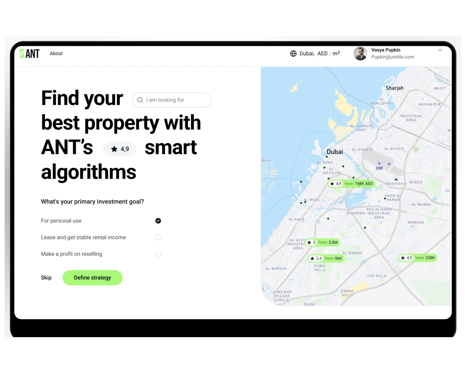
Property marketplace web platform with listing CMS, search and B2B admin console for US and EU operators.
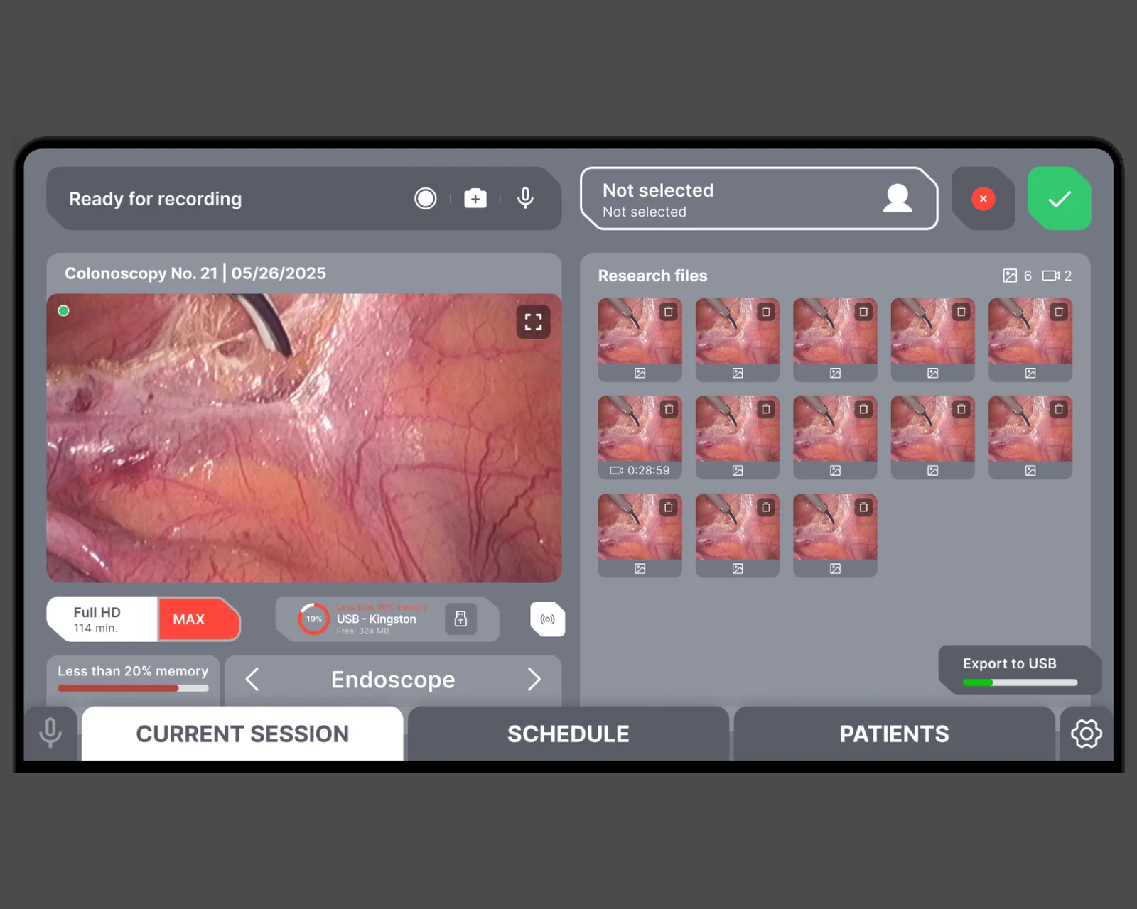
Tablet-first endoscopy recording, patient records, and DICOM/HL7 export — built on Laravel + React with browser-tier WebRTC capture for US & EU clinics.
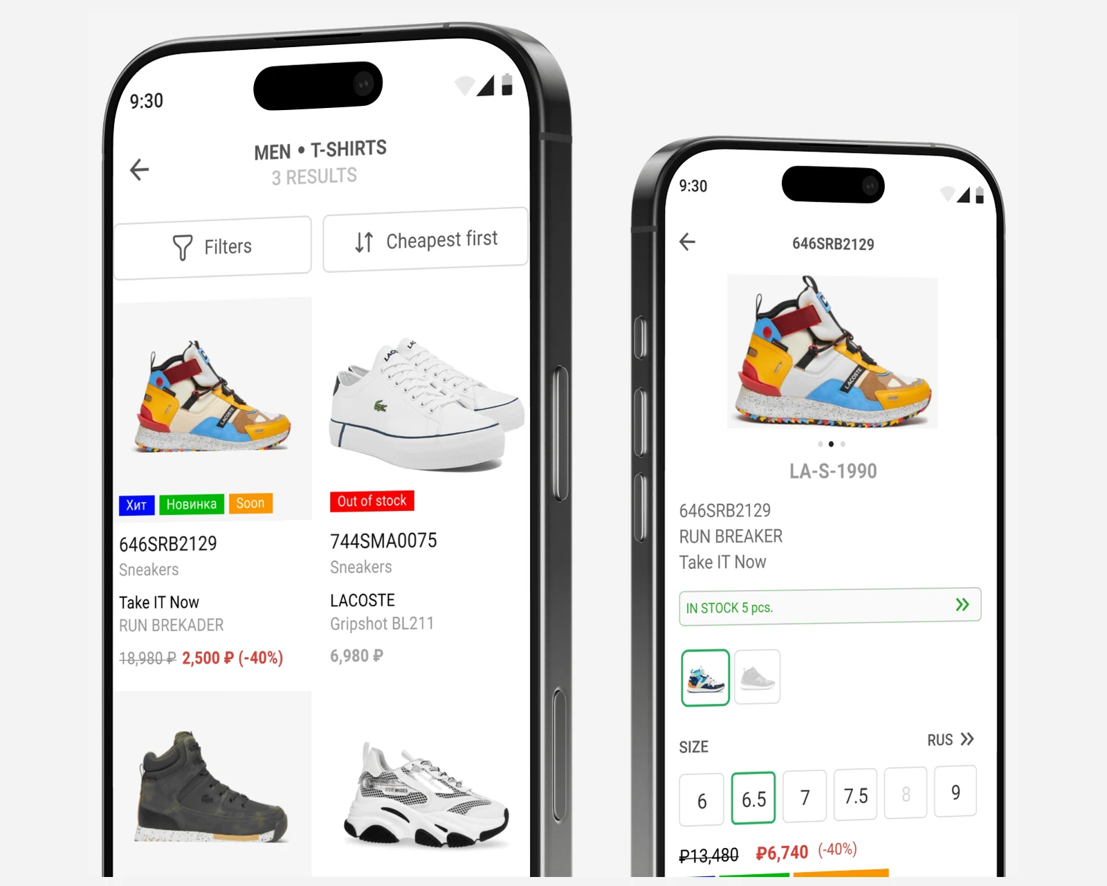
Retail POS companion app for a multi-brand boutique chain — ElasticSearch cross-store inventory search, 1C-system integration.
Why YuSMP
Every Tailwind project starts with a token audit — we map your brand to design tokens before writing a single utility class, so rebrands cost hours, not weeks.
Radix UI primitives, axe-core CI and contrast-checked tokens — accessibility is designed into the system, not audited at the end.
Chromatic Storybook pipelines catch dark-mode failures, layout regressions and token drift on every PR — before they reach production.
FAQ
Tailwind for component-rich React and Next.js applications where co-located utility classes reduce context switching and design tokens provide systematic constraints. CSS Modules for design systems that must ship as a standalone library consumed by non-Tailwind projects. Most SaaS dashboards and B2B portals land on Tailwind.
Tailwind config as the single source of truth for design tokens — colours, spacing, typography, border-radius, shadows. CVA (Class Variance Authority) for component variant APIs. shadcn/ui as a component foundation where it fits. Storybook with Chromatic visual regression to catch token drift across teams.
Tailwind v4 brings a CSS-based configuration, native CSS cascade layers and significantly faster builds via LightningCSS. Migration is straightforward for most projects — the class names are identical. We recommend new projects use v4 directly and plan v3 → v4 migration for existing projects after stabilisation.
class strategy so dark mode is controlled by JavaScript — toggled via a root class. Semantic colour tokens (background-primary, text-secondary) in the Tailwind config so dark values are swapped at the token level, not per-component. We test dark mode in Storybook and Chromatic.
Radix UI or Headless UI for accessible component primitives — keyboard navigation, ARIA attributes and focus management handled by the library. Tailwind handles visual styling only. We run axe-core in CI and test with screen readers on key flows. Colour contrast checked against WCAG 2.2 Level AA at design-token level.
CVA for typed component variant APIs — className logic lives in one place per component. Prettier plugin for Tailwind keeps class order consistent. ESLint with tailwind plugin to catch unknown and deprecated classes. Storybook as the living style guide — unused variants become visible when they have no story.
Response within 1 business day. NDA on request.
Share a few details and a senior consultant will reply within one business day.