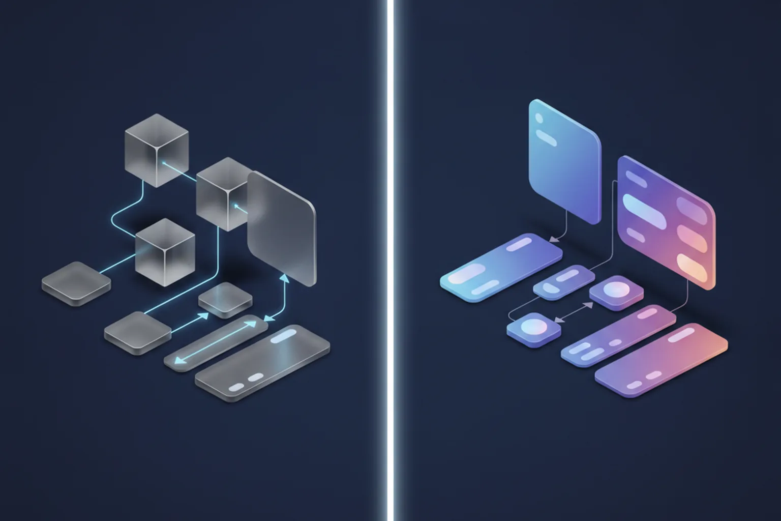

TL;DR — quick answer. UX design decides how a product works: research, user flows, information architecture and usability testing. UI design decides how it looks and responds: layout, typography, colour, components and micro-interactions. Invest in UX first when the problem or the flow is unproven; invest in UI depth when the flow works but the product feels dated or inconsistent.
For anyone paying for software, the difference between UX and UI matters less as a definition and more as a line in the budget. In real projects the two are layers of one design process, and both feed straight into engineering. Whether we are scoping mobile app development or web development, the quality of the UX and UI work decides how much the build costs, how long it takes and how much of it has to be redone after launch.
This guide looks at the UX vs UI design question from the buyer's side: what each discipline is and what it hands over, a head-to-head comparison table, when your product needs more of one than the other, team models, how to measure quality, the handoff to developers, and the effect on cost and timeline. The starting point is the line drawn by Nielsen Norman Group. Don Norman and Jakob Nielsen write that it is important “to distinguish the total user experience from the user interface (UI), even though the UI is obviously an extremely important part of the design.”
What is UX design?
UX design is the discipline of shaping how a product works for the people who use it: what they are trying to get done, which steps they take, where they get stuck and how the product helps them finish. Nielsen Norman Group's definition is deliberately broad: “‘User experience’ encompasses all aspects of the end-user's interaction with the company, its services, and its products.” That scope goes well beyond screens. The onboarding email, the wording of an error message, the wait for a verification code, the moment a customer phones support because a setting is buried three menus deep — all of that is user experience.
The term comes from Don Norman, who coined it in the 1990s while working at Apple, because “human interface” and “usability” seemed too narrow for everything a person goes through with a product. The distinction has held up for three decades. UX is about the structure and logic of an experience, not its surface, and a product can have a beautiful surface and a broken structure at the same time.
What does UX work involve day to day?
In practice, UX work is a loop of research, design and validation. The typical activities are:
- User research. Interviews, surveys, analytics reviews and direct observation to understand goals, context and pain points.
- Customer journey mapping. Following a user through every touchpoint, including the ones that happen outside the app, such as email, payment or delivery.
- Information architecture. Deciding how content and features are grouped, labelled and found, so navigation matches the way users think rather than the way the org chart looks.
- User flows. Step-by-step paths for the tasks that matter most: sign-up, checkout, booking, approving a request.
- Wireframes and prototypes. Low-fidelity layouts and clickable models that test structure before anything is styled.
- Usability testing. Watching real users attempt real tasks, noting where they hesitate or fail, and fixing the cause.
What ties these together is evidence. A good UX designer can tell you why a step exists, which user need it serves and what happened when people tried it.
What does a UX designer deliver?
UX output is mostly structural, which is why buyers tend to undervalue it: there is little to look at, but a lot to build on. From a UX phase you should expect:
- Research findings and personas that summarise who the users are, what they need and what currently blocks them.
- Customer journey maps showing the end-to-end experience and the moments where users drop out or need help.
- A sitemap or information architecture for the product, with navigation and naming agreed.
- User flows for every key task, including error paths and edge cases, not only the happy path.
- Low-fidelity wireframes for the main screens, deliberately grey so discussion stays on structure.
- A clickable prototype that stakeholders and test users can walk through on a real device.
- A usability test report listing the issues found, how severe they are and what was changed.
What is UI design?
UI design is the discipline of shaping how a product looks, feels and responds at the moment of interaction. If UX decides that a checkout has three steps, UI decides what each step looks like: the grid, the typography, the colour of the primary button, how a form field signals an error and how the screen reflows from a phone to a wide monitor. The US Bureau of Labor Statistics describes the focus of digital designers in exactly these terms: “the look and feel … photos, color, font type and size, graphics, and layout.”
UI is not decoration. Visual hierarchy tells users what to do next, consistent components teach them how the product behaves, and accessible contrast and tap targets decide whether some people can use it at all. The core areas of UI work are:
- Layout and grid. Spacing, alignment and the underlying structure that keeps screens calm and scannable.
- Typography. Typefaces, sizes, weights and line lengths chosen so text stays readable on every screen.
- Colour palette. Brand colours plus semantic colours for success, warning and error, with enough contrast between them.
- Iconography and imagery. One consistent icon set and illustration style.
- Components and states. Buttons, inputs, cards and menus in every state: default, hover, pressed, disabled, loading, error and empty.
- Motion and micro-interactions. Transitions and small bits of feedback that confirm an action happened.
- Responsive behaviour. How each layout adapts across breakpoints and orientations.
- Visual accessibility. Contrast ratios, tap target sizes and visible focus states that meet WCAG.
What does a UI designer deliver?
UI output is what most people picture when they hear the word “design”, but the part a development team actually needs goes further than polished screens. A complete UI phase produces:
- High-fidelity mockups for every screen and every state, including empty, loading and error screens.
- A UI kit or component library with reusable elements and documented variants.
- Design tokens: named values for colour, spacing, typography, radius and elevation that developers can map straight to code.
- Interaction specs describing animations, transitions and gesture behaviour.
- Exported assets, meaning icons and images in the right formats and resolutions.
- A dev-ready handoff file, usually in Figma, the most common tool for this work today, with tidy layers, auto-layout and inspectable specs.
A simple way to tell UX and UI apart
Think of an airport. UX is how quickly and calmly you get from the entrance to your gate: where check-in sits relative to security, how the queues are organised, whether the route to the gate makes sense without asking anyone. UI is the signage itself: the typeface, the colour coding, the icons for baggage and toilets, the boards placed at eye level where you actually look.
Perfect signs cannot rescue a terminal where security sits at the wrong end of the building, and a perfectly planned terminal still loses passengers if nobody can read the signs. Digital products fail in the same two ways. That is why the UX vs UI debate is never an either-or choice for long: you can delay one, but you cannot skip it.
UX vs UI design: head-to-head comparison
The table below sums up the difference between UX and UI on the points that matter when you plan, staff or buy design work. Most rows are expanded in the sections that follow.
| Aspect | UX design | UI design |
|---|---|---|
| Core question | Does this product solve the problem, and can people complete their tasks? | Is each screen clear, consistent, attractive and easy to act on? |
| Focus | Structure, logic and flow of the whole experience | Visual and interactive layer of each interface |
| Main activities | User research, journey mapping, information architecture, user flows, wireframing, usability testing | Layout, typography, colour, iconography, component design, motion, responsive design |
| Key deliverables | Personas, journey maps, sitemap, flows, wireframes, prototype, test report | High-fidelity mockups, UI kit, design tokens, interaction specs, assets |
| Typical tools and methods | Interviews, analytics, card sorting, prototyping tools, moderated and unmoderated tests | Figma and similar design tools, component libraries, contrast checkers, motion tools |
| Skills | Research, analysis, systems thinking, facilitation, interaction design | Visual design, typography, colour theory, attention to detail, design systems |
| When in the project | Starts first, in discovery, and continues after launch | Builds on validated flows; peaks before and during development |
| How success is measured | Task success rate, time on task, error rate, drop-off, SUS score | Consistency, accessibility compliance, preference tests, UI defect count |
| Scope | Any touchpoint, digital or not | Digital interfaces: screens, controls, visual feedback |
| Who it serves inside the team | Product owner and stakeholders deciding what to build | Developers and QA deciding how to build and check it |
| Typical failure when skipped | A polished product nobody can finish a task in; costly rework after launch | A logical product that looks untrustworthy, inconsistent or hard to scan |
| Output handed to developers | Flows, acceptance logic, edge cases and validated prototypes | Component specs, tokens, states and pixel-level layouts |
How do UX and UI work together in a real project?
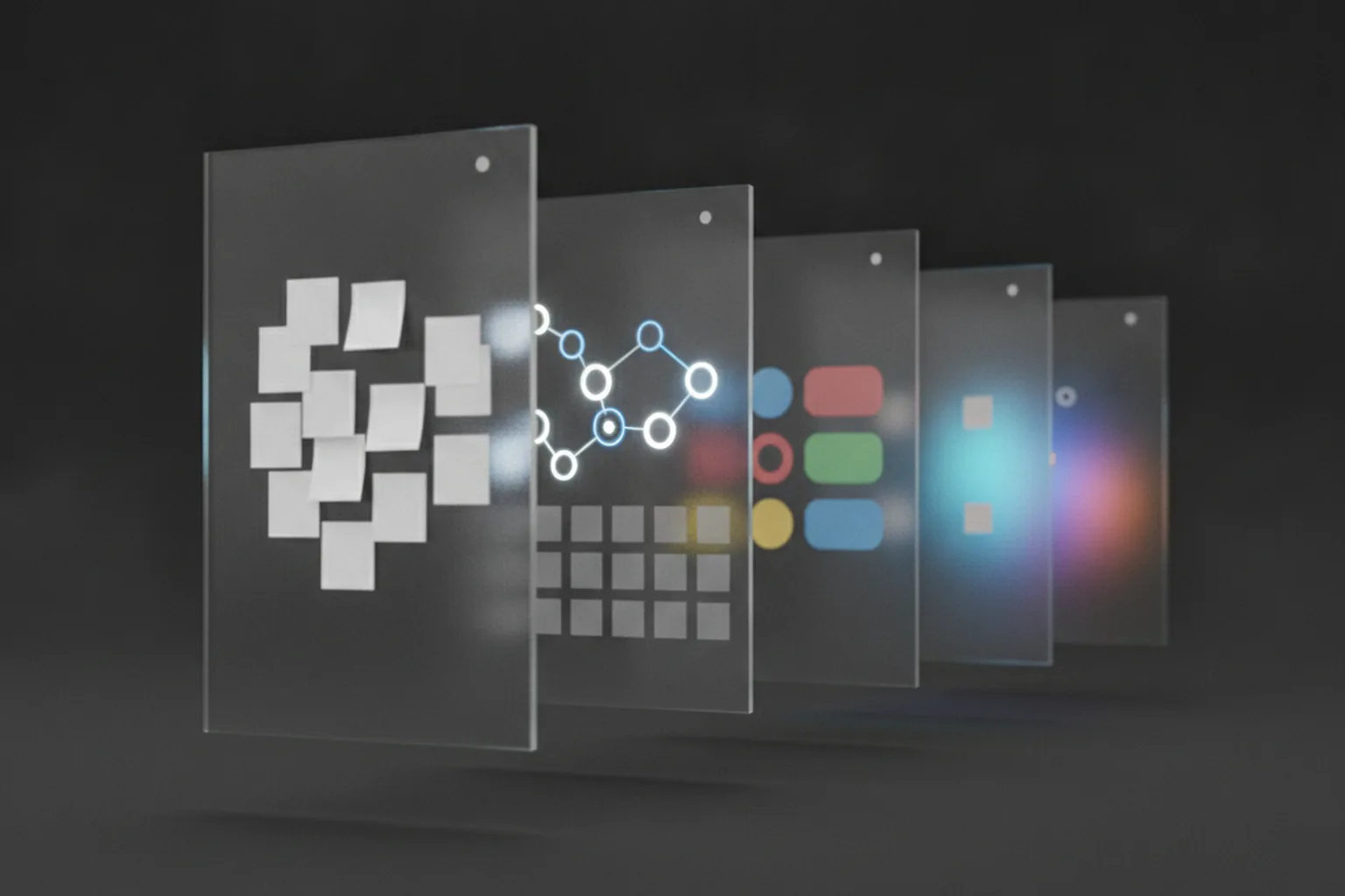
UX and UI work as a sequence with overlap: UX validates the structure first, UI turns that structure into a consistent visual system, and both keep iterating after launch. In a typical product project, the work runs like this:
- Discovery. Research with users and stakeholders defines the problem, the audience and the success metrics. This is also where you decide whether you need a prototype, a proof of concept or an MVP.
- Information architecture and user flows. The team agrees on what the product contains and how users move through it.
- Wireframes. Grey, low-fidelity layouts of the key screens make the structure visible without arguments about colour.
- Usability testing. A clickable prototype goes in front of five to eight target users, and the flows are fixed where they stumble.
- UI visual design. The validated wireframes become high-fidelity screens with typography, colour and imagery.
- Design system. Repeating elements are turned into components and tokens so every new screen reuses the same parts.
- Developer handoff. Specs, states and assets go to engineering, and designers stay available during sprints to answer questions.
- Post-launch iteration. Analytics and feedback show where users still struggle; UX reworks the flow and UI updates the components.
The steps overlap in practice. UI designers often start a visual direction while late usability tests run, and UX designers keep testing during development. What should not overlap is high-fidelity UI on flows nobody has tested. How the steps map onto sprints depends on your delivery model; our comparison of Agile and Waterfall covers that choice.
What good UX with weak UI (and the reverse) looks like
The clearest way to see the difference between UX and UI is to look at products where one is strong and the other is weak. Both scenarios below are common, and both lose users for different reasons.
Scenario A: a logical checkout that users cannot see
A retail app has a well-researched checkout: three steps, address autofill, saved payment methods and a clear order summary. The flow is right. But the “Place order” button is a thin outline in a pale colour, squeezed next to a “Back” link of the same size, and on smaller phones it sits under the keyboard. Session recordings show users scrolling up and down, tapping the summary, then leaving.
The lesson: good UX defines the right steps, but weak UI can hide the one action that matters. The fix is a UI fix — a high-contrast primary button, a sticky action bar and clear visual priority — and it is cheap because the structure underneath is sound.
Scenario B: a polished onboarding that wears users out
A fintech app opens with a beautiful onboarding: smooth animations, custom illustrations, a carefully tuned colour palette. It also asks users to swipe through five introduction screens, create a password with hidden rules and confirm notification settings before they see a single feature. Every screen looks premium. Drop-off between install and first use is high.
The lesson: strong UI cannot compensate for a flow with unnecessary steps. The fix is a UX fix — cut the introduction, defer permissions to the moment they are needed, show the product first — and it often means throwing away polished screens that took weeks to make.
When should you invest more in UX?
Put more of your design budget into UX when the main risk is building the wrong thing or the wrong flow. These are the situations where research and testing pay back fastest:
A new product or an unproven idea
You do not yet know which problem users will pay to solve or how they want to solve it. Discovery and prototype testing reduce the risk before any code is written.
Complex workflows
B2B platforms, fintech, healthcare and logistics products have multi-step processes, roles and permissions. Mapping the flows properly prevents dead ends that are expensive to rebuild.
High drop-off or “how do I…” tickets
If analytics show users abandoning a funnel, or support is flooded with navigation questions, the problem is usually structure, not styling.
Merging several tools or roles into one app
Consolidation projects need new information architecture. Copying the old screens side by side recreates the old confusion in a new codebase.
Regulated or accessibility-critical audiences
Older users, patients, public-sector services and financial products need flows tested with the actual audience, not assumed from a generic pattern.
When should you invest more in UI?
Put more budget into UI when the flow already works and the main risk is how the product is perceived, or how consistently it is built. These are the typical triggers:
A proven flow that looks dated
Users complete their tasks, but the product looks older than its competitors and loses trust in demos, sales calls and app store screenshots.
Inconsistent screens after years of growth
Five button styles, three date pickers and screens built by different teams. A design system restores consistency and speeds up every future feature.
A rebrand
New brand colours, typography and tone need to reach every screen, ideally through tokens rather than a manual hunt through hundreds of files.
Consumer apps where perceived quality sells
In crowded categories, visual polish and smooth micro-interactions shape first impressions, store ratings and whether a trial user stays.
Multi-platform parity
When iOS, Android and web versions drift apart, a shared component library brings them back in line while respecting each platform's conventions.
Do you need one UI/UX designer or separate specialists?
Most early-stage products are well served by one strong product designer who covers both UX and UI; separate specialists start to pay off when research load, product complexity or the number of screens outgrows one person. That is why so many job ads ask for a “UI/UX designer”: in small teams the roles genuinely merge, and splitting them too early adds handoffs without adding much quality.
The merged title hides a real trade-off, though. Few people are equally strong at running interviews and analysing behaviour on one side and crafting typography and component systems on the other. When you hire or contract a generalist, ask to see both research artefacts and finished UI, not just a portfolio of beautiful screens.
| Team model | Fits | Risk |
|---|---|---|
| One product designer (UI/UX generalist) | MVPs, early-stage startups, small teams with one product | Research gets squeezed under delivery pressure; one person becomes a bottleneck as screens multiply |
| Separate UX researcher/designer and UI designer | Complex or regulated products, scale-ups, several user roles | Handoff gaps between the two; needs a shared design system and regular syncs |
| Design embedded in a dedicated development team | Ongoing product work, continuous releases, outsourced delivery | Design can drift into pure production work unless research time is protected in the plan |
If you are weighing in-house hiring against a partner, salary data gives a rough sense of scale. The US Bureau of Labor Statistics reports a median annual pay of $104,000 for web and digital interface designers in May 2025, against $92,650 for web developers, and projects 5% employment growth for the occupation group from 2025 to 2035. One caveat matters: BLS does not track UX designers as a separate occupation. Official hiring data blends the two roles, which is one more sign of how often they are treated as one job in practice.
Does UX vs UI change for mobile apps and web products?
The disciplines stay the same, but the constraints shift: mobile squeezes UX decisions onto a small screen and into platform conventions, while web products deal with a wider range of screen sizes, denser interfaces and search visibility.
UX and UI in mobile apps
On mobile, both layers lean on platform guidelines. Apple's Human Interface Guidelines and Google's Material Design define navigation patterns, gestures, component behaviour and accessibility expectations that users already know. Ignoring them makes an app feel foreign even when it looks good. Mobile UX also has to plan for thumb reach, interrupted sessions, weak or absent connections and offline states, permission prompts and notifications. The small screen forces prioritisation: there is room for one primary action per view, so UX has to decide what that action is. UI then works within tight space, adapting typography and tap targets to different screen densities.
UX and UI in web products
On the web, UI has to hold up across responsive breakpoints, from a phone to an ultra-wide monitor, and keyboard and screen-reader navigation matter more. B2B web apps often carry dense dashboards and data tables, where information architecture and visual hierarchy decide whether users find anything at all. Public pages add another constraint: a clear, semantic structure helps search engines understand content, so IA decisions affect SEO as well as usability.
Design effort also shows up in delivery time differently on each platform; our guides on how long it takes to build a mobile app and how long it takes to build a web app break down where design sits in the schedule.
How do you measure UX and UI quality?
UX quality is measured by whether people can complete their tasks efficiently; UI quality is measured by consistency, accessibility and how clearly the interface communicates. Both can be tracked, and both should be agreed before design starts so that “good design” is not left to taste.
Which metrics show UX quality?
UX metrics focus on behaviour and outcomes:
- Task success rate: the share of test users who complete a defined task without help.
- Time on task: how long the task takes, compared between versions or against a target.
- Error rate: wrong taps, validation errors and backtracking during a task.
- Funnel conversion and drop-off: where users abandon sign-up, onboarding or checkout in production analytics.
- System Usability Scale (SUS): a standard ten-question questionnaire that gives a comparable usability score.
- Support tickets: the volume and type of “how do I…” questions, which point straight at unclear flows.
Which metrics show UI quality?
UI metrics focus on the interface itself:
- Visual consistency: how much of the product is built from shared components rather than one-off variants.
- Accessibility checks: colour contrast against WCAG thresholds, tap target sizes and focus visibility.
- Preference and five-second tests: what users remember and which visual direction they trust after a brief look.
- UI defect count in QA: misaligned elements, missing states and mismatches between design and build.
The two sets interact. A UI change that raises contrast on a primary button can move a UX metric such as checkout completion, which is exactly why teams should watch both rather than argue about which one matters more.
What happens at the design-to-development handoff?
The handoff is the point where design becomes engineering work, and its quality has a direct effect on development time. A good handoff gives developers everything they need to build each screen without guessing: a design system with documented components, design tokens that map to code, every state for every component, annotated prototypes that show behaviour, and the edge cases UX found during testing.
A weak handoff looks like a folder of static mockups with no states, no tokens and no notes. Developers then make dozens of small decisions themselves — what the empty state looks like, what happens on a failed upload, how a table behaves on a phone — and QA finds the gaps late. That time rarely shows up in a design estimate, but it inflates the development estimate and the bug list.
Design and requirements should travel together. A product requirements document (PRD) captures the business rules behind each flow, while the design files show how those rules appear on screen. At the end of the cycle, keep two checks apart: user acceptance testing (UAT) confirms that the built product meets the agreed requirements, while usability testing asks whether people can actually use it well. A feature can pass UAT and still fail a usability test.
Cost and timeline: how UX and UI affect your budget
UX work is concentrated at the start of a project, UI work grows with the number of screens and states, and skipping either one does not remove the cost — it moves it into rework later. Understanding that shape helps you plan design time sensibly instead of cutting it as the easiest line in the estimate.
A few patterns hold across most projects:
- UX effort peaks in discovery and the first sprints. Research, flows and prototype testing happen before most code exists, which is when changes are cheapest.
- UI effort scales with scope. Every additional screen, role, platform and state adds UI work, so a product with many variants needs more UI time than a simple one with a similar idea behind it.
- Skipping UX shifts cost into post-launch rework. A flow fixed in a wireframe costs hours; the same fix in a released product means design, development, QA and a new release.
- A design system raises the upfront cost and lowers the cost per screen later. For products with a long roadmap, components and tokens usually pay back; for a short-lived prototype, they may not.
| Phase | UX effort | UI effort |
|---|---|---|
| Discovery and research | High | Low (mood boards, visual direction) |
| Flows, wireframes and prototype testing | High | Low to medium |
| Visual design and design system | Medium (reviews, edge cases) | High |
| Development sprints | Medium (questions, validation) | Medium (new screens, states, QA review) |
| Post-launch iteration | Medium to high (analytics, testing) | Medium (component updates) |
The right balance depends on what you are building first. An MVP needs enough UX to validate the core flow and enough UI to look credible, not a complete design system; a full product build justifies more of both. Our comparison of an MVP vs a full product build covers that decision, and our software project estimation guide explains how design time fits into an overall estimate.
Common mistakes when teams treat UX and UI as the same thing
Most design problems we see in inherited products come from treating UX and UI as one activity called “design”, done once, in one go, by whoever is available. The recurring mistakes are:
- Going straight to high-fidelity mockups. The team approves beautiful screens before anyone has tested the flow, then discovers structural problems during development.
- Testing visuals instead of tasks. Asking users “do you like it?” measures taste. Asking them to complete a task measures whether the product works.
- No design system. Without shared components, every new feature introduces new variants, and the product slowly becomes inconsistent and slower to build.
- Designers excluded from sprint reviews. Small implementation decisions add up, and nobody who knows the intended experience is there to catch them.
- “Make it pretty” briefs. A brief that asks for a visual refresh when the real problem is a confusing flow produces a nicer-looking version of the same problem.
- Treating accessibility as optional. Low contrast, tiny tap targets and missing focus states exclude users and are far cheaper to avoid in design than to retrofit in code.
How YuSMP Group approaches UX and UI design
We treat UX and UI as two stages of one product design process, owned by the same team that builds the product. Every project starts with discovery and user flows before any visual design, so the structure is agreed and tested while changes are still cheap. Key flows are prototyped and walked through with real users or client stakeholders before development begins.
UI is built as a component library with tokens and documented states, so developers implement screens one to one instead of interpreting static pictures, and designers stay in sprint reviews to catch drift early. For early-stage products, that usually means one product designer covering both layers inside our MVP development process; for growing products, research and UI split into separate roles within our product engineering teams.
FAQ: UX vs UI design questions
What is the main difference between UX and UI design?
UX design decides how a product works: who the users are, which tasks they need to complete, which steps those tasks take and whether people can finish them without help. UI design decides how the product looks and responds on screen: layout, typography, colour, components, states and micro-interactions. In short, UX shapes the structure and flow of the experience, and UI shapes the visual and interactive layer that users touch.
Which comes first, UX or UI?
UX comes first. Research, information architecture, user flows and wireframes define what the product contains and how users move through it, and usability tests confirm that the structure works. UI design then turns the validated wireframes into high-fidelity screens and a component system. The two overlap in practice, because visual direction can start while late tests run, but detailed UI should not be built on a flow that nobody has tested.
Can one person do both UX and UI design?
Yes, and in small teams one person usually does. Product designers and UI/UX generalists cover research, flows, wireframes and visual design, which works well for MVPs and early-stage products. The limits appear as the product grows: research gets squeezed by delivery pressure and one designer becomes a bottleneck. At that point teams often split the work between a UX researcher or designer and a UI designer who share one design system.
Is UX design harder than UI design?
Neither is harder in general; they demand different strengths. UX design relies on research, analysis, facilitation and systems thinking, and its results are harder to show because the output is mostly structural. UI design relies on visual skill, typography, colour, detail and the discipline to build consistent component systems. People who enjoy understanding behaviour tend to prefer UX, while people who enjoy crafting interfaces tend to prefer UI.
Is UI design just graphic design?
No. Graphic design and UI design share visual foundations such as typography, colour and composition, but UI design is interactive. A UI designer has to plan every state of a component, how screens respond to taps and gestures, how layouts adapt across devices and how the interface meets accessibility requirements. UI work also has to be buildable, so it is delivered as components, tokens and specs that developers can implement directly in code.
Do I need UX design for an MVP?
Yes, but a lean version. An MVP exists to test whether users want the product, so the core flow has to be clear enough that a failed test means weak demand rather than confusing design. In practice that means short discovery, flows for the few key tasks, a clickable prototype tested with five to eight target users and simple, consistent UI. A full design system and extensive research can wait until the MVP proves itself.
What tools do UX and UI designers use?
Both groups commonly work in Figma for wireframes, prototypes, high-fidelity screens and component libraries. UX designers add research and testing methods: interviews, surveys, analytics platforms, card sorting, session recordings and moderated or unmoderated usability tests. UI designers add icon and illustration tools, colour-contrast checkers, motion and prototyping tools, and design-token workflows that connect the component library to the codebase. The method matters more than the specific tool.
How do UX and UI affect app store ratings and conversion?
Both influence them, in different ways. UX determines whether users can complete key tasks such as sign-up, purchase or booking, so broken or long flows show up as drop-off, abandoned funnels and frustrated reviews. UI determines first impressions and clarity: polished screenshots, readable text and obvious primary actions build trust and make the next step easy to find. The strongest results come from improving both and measuring their effect in analytics.
Is UX or UI more important for a B2B product?
UX usually carries more weight in B2B products. Business software often involves complex workflows, several user roles, permissions and large amounts of data, so clear information architecture and efficient flows have the biggest effect on productivity and adoption. UI still matters: consistent components, readable data tables and clear visual hierarchy reduce errors and training time. Many B2B teams start with UX research and then invest in a design system for consistency.
Verdict: UX vs UI — which does your product need?
For almost every product, the answer to UX vs UI is “both, in the right order”. Where the emphasis goes depends on the stage your product is at today.
- Lead with UX if the product is new, the flow is unproven, the workflow is complex or analytics show users failing to finish key tasks. Research and tested prototypes reduce the risk of building the wrong thing.
- Lead with UI if the flows already work but the product looks dated, inconsistent or out of line with competitors. Invest in a design system so the refresh lasts beyond one release.
- Plan for both if you are building a real product meant to grow. Sequence the work UX first, then UI, keep one product designer accountable for both early on, and split the roles as the team and the product grow.
Whichever way you lean, keep design close to development. The best UX and UI work is the work developers can build without guessing and users can use without thinking about it.